Food52

Mobile Checkout

results

40% lift in checkout completion • 30% faster registration & checkout • 150% lift brand confidence

2 WK : RESEARCH, WORKSHOPS, VISION, UX/UI, PROTOTYPES, TESTING

Web, App, Design System

Purchase Trust & Confidence

"I need to just have blind faith that I will get what I am ordering"


While Food52 saw high content engagement, the checkout experience was a point of significant friction. As users transitioned from high-end editorial content to a complex drop-shipping logistics flow, "purchase confidence" plummeted. I was tasked with evolving the UX/UI to bridge the gap between luxury brand sentiment and functional e-commerce reliability to meet OKRs.

The Outcome

The redesign didn't just modernize the UI; it validated a new internal standard for how Food52 handles complex logistics.

  • 40% lift in Purchase completion

  • 30% faster registration & checkout

  • 150% lift brand confidence

  • 100% W3C legal Compliance Score

  • 15% reduction in cart abandonment.

  • Beta testers cited the "Edit Order" modal as the primary reason for their increased trust in the process.

The Challenge

Lower performance numbers than retail averages, and high bounce rates throughout the funnel required a multi-layers approach to both the UX and UI. User Research showed glaring opportunities :


  • 85% of visitors were unregistered, new visitors

  • 5-15% retention rates

  • $80-260 AOV loss in checkout abandonment

  • 15-20% completion rates

  • 30% W3C legal compliance score

The Strategy

Moving from "blind faith" to "informed trust"

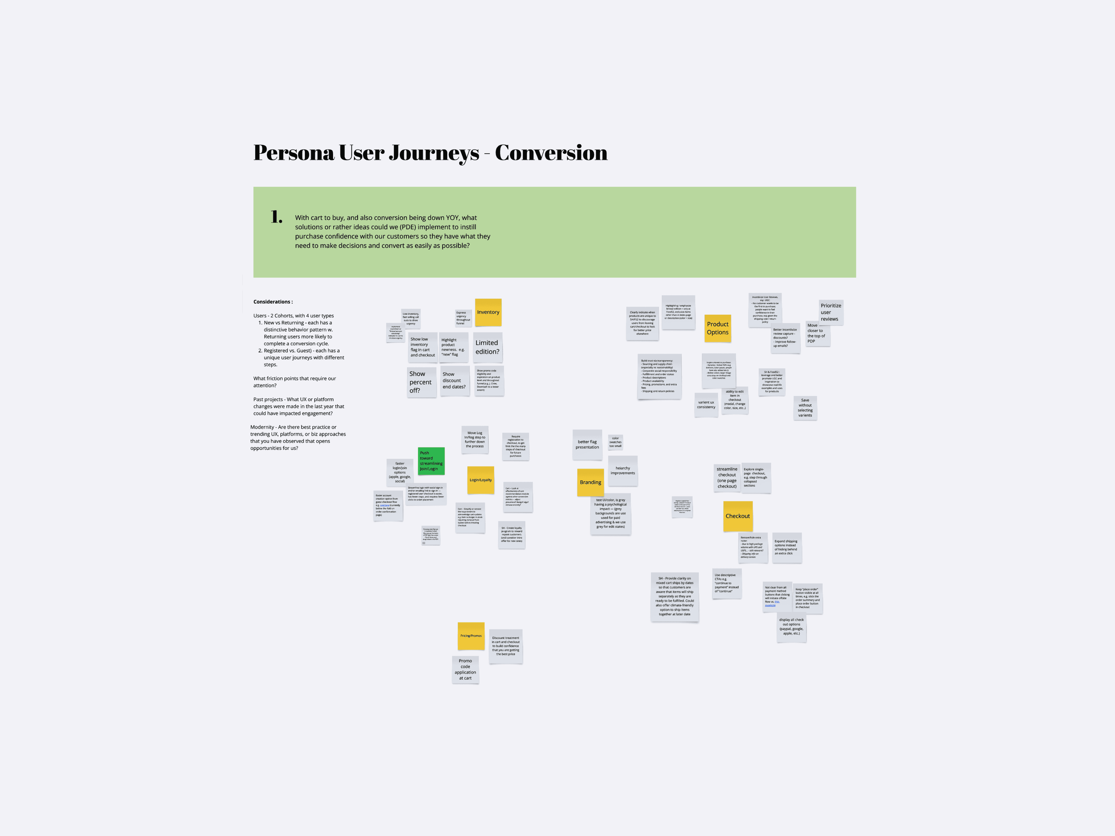
I facilitated a cross-functional design sprint with Product, Engineering, and Marketing. In Design Sprint Workshops, we mapped the e-commerce ecosystem and level of effort against six distinct user archetypes and identified four strategic pillars:


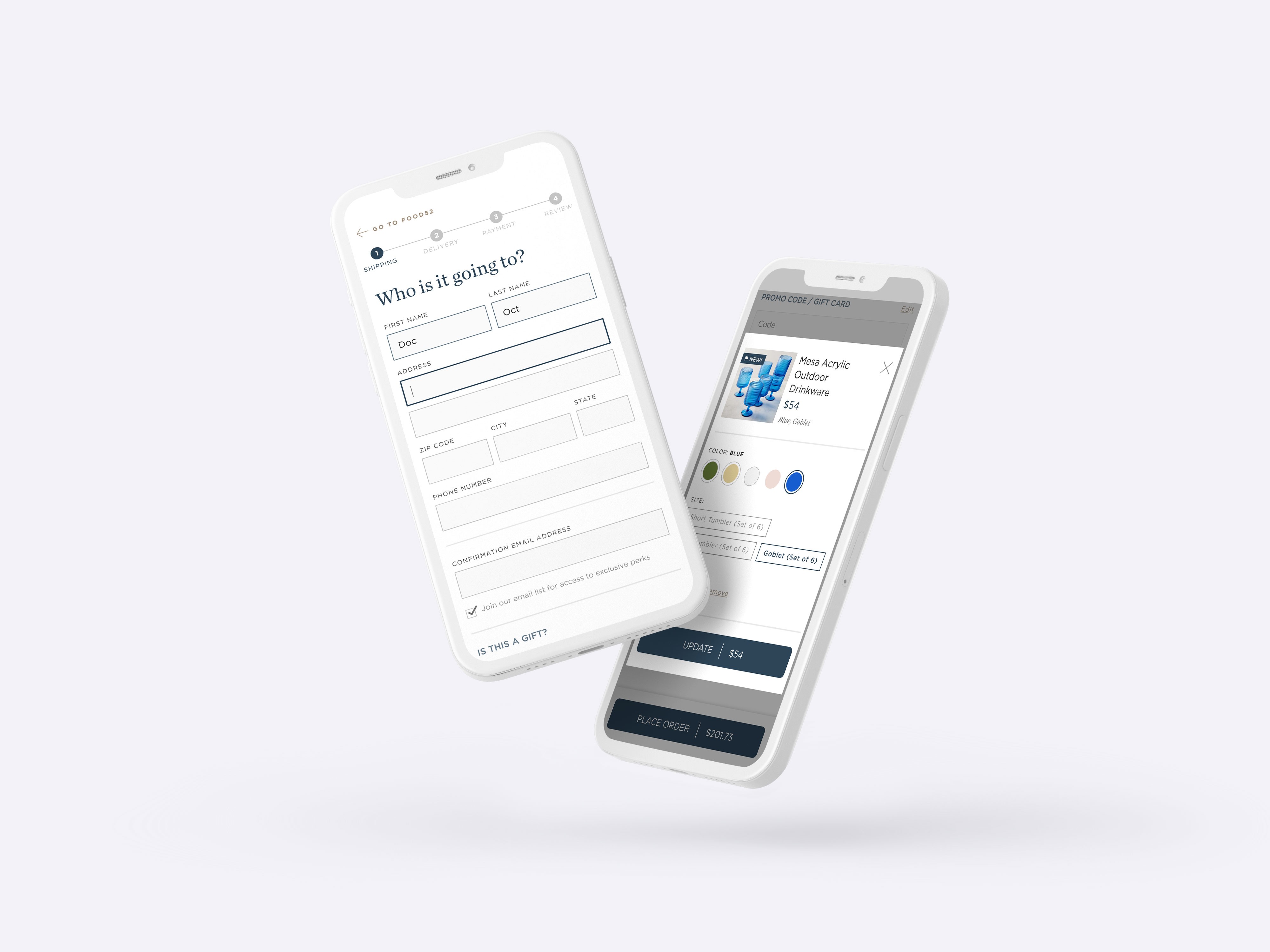
  1. Transactional Clarity: Implementing a high-hierarchy "mini-funnel" (Identity, Shipping, Payment, Review).

  2. Intent-Driven Content: Rewriting technical logistics jargon into human-centric, brand-aligned copy.

  3. Systemic Refinement: Architecting an ADA-compliant design system to reduce cognitive load and visual noise.

  4. Reduce Errors: Redesign UI elements to reduce confusion, errors and support desirability in exclusive purchases

To validate our hypothysis on clarity, I interviewed several VIP customers as they went through the checkout flow. Confirming my heuristic audit findings to finalize iterative requirements.

The Execution

Refining the Funnel By applying Jakob’s Law, I introduced a familiar, modular modal system. This allowed users to edit orders without losing their place in the funnel, addressing a top friction point identified in user testing.

Intentional Friction by introducing a "gated" removal process. Instead of a mindless "Delete" action, we created a moment of reflection that reminded users of their choices. This paradoxical use of friction actually increased product retention and reinforced user confidence in the final checkout stage.

Systems Thinking: Accessibility & Scalability To ensure the new checkout could scale alongside Food52’s rapidly expanding catalog while maintaining WCAG 2.1 AA standards, I led a systemic audit of the core checkout components. I replaced legacy "one-off" UI patterns with a modular, token-based library that prioritized high-contrast color scales and accessible typography for increased readability. By engineering a suite of reusable components. From dynamic error-handling states to accessible payment modals, we created a future-proof framework that reduced design-to-engineering handoff time and ensured a consistent, inclusive experience.


Leadership & Strategic Reflection

Orchestrating Cross-Functional Alignment Beyond the UX/UI, my primary role was to bridge the gap between aggressive business OKRs and human-centric design. By leading the initial design sprint, I moved the conversation from "adding features" to "solving for trust." I facilitated a shared language between Product and Engineering (who needed clear component governance) and Marketing (who needed to maintain the brand’s luxury editorial feel.) This collaborative approach ensured that the final solution wasn't just a design handoff, but a product strategy that everyone was invested in.

The "Intentional Friction" Paradox. One of the most significant takeaways from this project was the success of the "Gated Remove" UX. While traditional e-commerce wisdom suggests removing all friction, we found that a moment of reflection actually increased purchase confidence. It taught the team that "frictionless" isn't always synonymous with "better." Sometimes, a purposeful pause is exactly what a user needs to feel secure in a high-consideration purchase.

Adaptive Personalization. Looking into how the checkout experience can dynamically shift based on user archetypes. Providing more educational "hand-holding" for first-time buyers while offering a "lightning-checkout" for high-frequency repeat customers.

2026© wren bach design studio & portfolio
available for projects / for hire
cv
2026© wren bach design studio & portfolio
available for projects / for hire
cv
2026© wren bach design studio & portfolio
available for projects / for hire
cv